在之前的项目中,UI告诉我说我们移动项目中的边框全部都变粗了。原谅我的近视眼,为什么我看不出什么差距了,结果UI把他的设计稿跟我的屏幕截图跟我看,居然真的不一样!!!
没有办法,只有在后面的版本中去修改了,但是要改的话,需要知道是为什么。所以查了很多资料,终于搞懂了这个问题,并且总结了几种方法。
造成边框变粗的原因
其实这个原因很简单,因为css中的1px并不等于移动设备的1px,这些由于不同的手机有不同的像素密度。在window对象中有一个devicePixelRatio属性,他可以反应css中的像素与设备的像素比。
devicePixelRatio的官方的定义为:设备物理像素和设备独立像素的比例,也就是 devicePixelRatio = 物理像素 / 独立像素。
解决边框变粗的6种办法
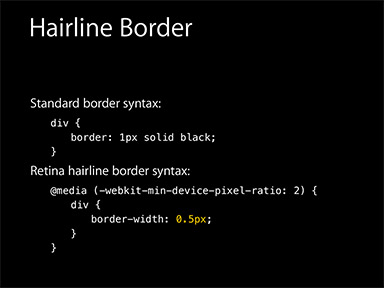
1、0.5px边框
在2014年的 WWDC,“设计响应的Web体验” 一讲中,Ted O’Connor 讲到关于“retina
hairlines”(retina 极细的线):在retina屏上仅仅显示1物理像素的边框,开发者应该如何处理呢。
他们曾介绍到 iOS 8 和 OS X Yosemite 即将支持 0.5px 的边框:
额的神呐!so easy! 果真如此吗?
这样还不够(WWDC幻灯片通常是“唬人”的),但是相差不多。
问题是 retina 屏的浏览器可能不认识0.5px的边框,将会把它解释成0px,没有边框。包括 iOS 7 和之前版本,OS X Mavericks 及以前版本,还有 Android 设备。
解决方案:
解决方案是通过 JavaScript 检测浏览器能否处理0.5px的边框,如果可以,给html标签元素添加个class。
1 | if (window.devicePixelRatio && devicePixelRatio >= 2) { |
然后,极细的边框样式就容易了:
1 | div { |
优点:
- 简单,不需要过多代码。
缺点:
- 无法兼容安卓设备、 iOS 8 以下设备。
2、使用border-image实现
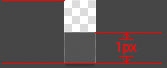
准备一张符合你要求的border-image:
样式设置:
1 | .border-bottom-1px { |
上文是把border设置在边框的底部,所以使用的图片是2px高,上部的1px颜色为透明,下部的1px使用视觉规定的border的颜色。如果边框底部和顶部同时需要border,可以使用下面的border-image:
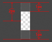
样式设置:
1 | .border-image-1px { |
到目前为止,我们已经能在iphone上展现1px border的效果了。但是我们发现这样的方法在非视网膜屏上会出现border显示不出来的现象,于是使用Media Query做了一些兼容,样式设置如下:
1 | .border-image-1px { |
优点:
- 可以设置单条,多条边框
- 没有性能瓶颈的问题
缺点:
- 修改颜色麻烦, 需要替换图片
- 圆角需要特殊处理,并且边缘会模糊
3、使用background-image实现
background-image 跟border-image的方法一样,你要先准备一张符合你要求的图片。然后将边框模拟在背景上。
样式设置:
1 | .background-image-1px { |
优点:
- 可以设置单条,多条边框
- 没有性能瓶颈的问题
缺点:
- 修改颜色麻烦, 需要替换图片
- 圆角需要特殊处理,并且边缘会模糊
4、多背景渐变实现
与background-image方案类似,只是将图片替换为css3渐变。设置1px的渐变背景,50%有颜色,50%透明。
样式设置:
1 | .background-gradient-1px { |
优点:
- 可以实现单条、多条边框
- 边框的颜色随意设置
缺点:
- 代码量不少
- 圆角没法实现
- 多背景图片有兼容性问题
5、使用box-shadow模拟边框
利用css 对阴影处理的方式实现0.5px的效果
样式设置:
1 | .box-shadow-1px { |
优点:
- 代码量少
- 可以满足所有场景
缺点:
- 边框有阴影,颜色变浅
6、viewport + rem 实现
同时通过设置对应viewport的rem基准值,这种方式就可以像以前一样轻松愉快的写1px了。
在devicePixelRatio = 2 时,输出viewport:
1 | <meta name="viewport" content="initial-scale=0.5, maximum-scale=0.5, minimum-scale=0.5, user-scalable=no"> |
在devicePixelRatio = 3 时,输出viewport:
1 | <meta name="viewport" content="initial-scale=0.3333333333333333, maximum-scale=0.3333333333333333, minimum-scale=0.3333333333333333, user-scalable=no"> |
这种兼容方案相对比较完美,适合新的项目,老的项目修改成本过大。
对于这种方案,可以看看《使用Flexible实现手淘H5页面的终端适配》
优点:
- 所有场景都能满足
- 一套代码,可以兼容基本所有布局
缺点:
- 老项目修改代价过大,只适用于新项目
7、伪类 + transform 实现
对于老项目,有没有什么办法能兼容1px的尴尬问题了,个人认为伪类+transform是比较完美的方法了。
原理是把原先元素的 border 去掉,然后利用 :before 或者 :after 重做 border ,并 transform 的 scale 缩小一半,原先的元素相对定位,新做的 border 绝对定位。
单条border样式设置:
1 | .scale-1px{ |
四条boder样式设置:
1 | .scale-1px{ |
最好在使用前也判断一下,结合 JS 代码,判断是否 Retina 屏:
1 | if(window.devicePixelRatio && devicePixelRatio >= 2){ |
优点:
- 所有场景都能满足
- 支持圆角(伪类和本体类都需要加border-radius)
缺点:
- 对于已经使用伪类的元素(例如clearfix),可能需要多层嵌套

